Case Studies
Sentinel Capital Partners
New York
Sentinel Capital Partners is one of the leading private equity firms in New York City. This award-winning logo is a graphic depiction of a mountain standing "sentinel" as a protection of money.
Wisdom Capital Partners
Greenwich, Connecticut
Wisdom is a new investment shop that needed a logo and a web site. We developed a unique figure-ground reversal logo that's easily recognizable, smart and sophisticated to match the experience and expertise of the firm's founder.
Due West Capital Partners
Seattle, WA
Due West is a family office in Seattle that asked for a logo that wasn't a typical Private Equity logo. We used modern fonts and a subtle western-pointing arrow.
Talisman Capital Partners
Columbus
There are a lot of elements to factor in when you're trying to make a logo "simple." We use thicks, thins, and interesting kerning to create hierarchy and clarity."
Chart Capital Partners
New York
Chart and navigation themes create a lot of clutter in the private equity design. We wanted super clean and iconic. We used a font indicative of charts with a gentle reminder of direction.

Roundshield Partners
London
Roundshield Partners is a London-based firm providing capital solutions to small and mid-cap European businesses. With their unique name, we new the branding had to be descriptive without overdetailed. We came up with a unique and simple approach.
Westwood Partners
Seoul
The best design is knowing how to unclutter a design and still make it impactful. The diagonal stripe does this perfectly.
Glenwood Partners
Seoul
We employed overlapping mountains to create a dual image of mountains and a graph.
Bluffview Capital Partners
Dallas / Houston
Bluffview is an Energy Private Equity firm and looked for a logo that embellished their "Bluffview" name. We did a reduced-color symbol that hits the spot.
Peloton Equity
Greenwich, CT
Peloton’s concept is, “Work with us to harness the power of the peloton.” We combined the “p” and “e” and incorporated peloton riders to create a unique logo.
DCH Partners
New York
DCH Partners is a healthcare focused private equity firm. They were looking to lever their three initials, we reversed them out of a blue field using Copperplate.
Volcano Capital
New York
Volcano Capital invests in health care. We developed a logo that graphically interpreted a volcano (and the theme "up") and a site that gently rotates health care imagery on the homepage.
MVP Capital Partners
Radnor, Pennsylvania
MVP Capital Partners is a Philadelphia-based private equity firm investing in aviation, media, manufacturing and healthcare. We took the layout of their original logo, used a classic and smart typeface and created an interesting lock-up.
Caltius
Los Angeles, California
Caltius is an L.A.-based flexible equity and debt financing firm that found, like a lot of us, great inspiration from the Olympic themes of swifter, higher and stronger. We created a symbol that works with those themes and used a strong sans serif to match.
Sunlight Capital Partners
The symbol construction on this project was more difficult than expected. Sure, the Sun is appropriate, but how do you make it look smart and conservative? We created an iconic looking symbol and used an extended clearly-read typeface.
Saltbox Partners
New York
Saltbox is a small investment bank in New York City, we've included it here because it's one of our favorites. The founder of the firm is a native of New Hampshire and loves this style architecture because of it's efficiency, cleverness and intelligence. We created a logo to trumpet the themes.
Grey Mountain Partners
Boulder, Colorado | Minneapolis, Minnesota
Grey Mountain's credo is to help portfolio companies achieve operational excellence and creating value through improved operations. The firm has a definitive Colorado feel about it and that's reflected in their iconic mountain symbol and layout of the logo.
Laurel Capital Partners
Radnor, Pennsylvania
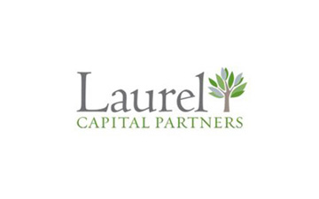
Laurel Capital Partners is a Philadelphia-based private equity firm. They wanted a logo that would break out of the financial-services clutter. We used a typeface not usually seen in the financial industry and then drew a laurel tree loosely for an eye-stopping symbol.
Ingleside Investors
New York
Ingleside is an integrated investment firm that wanted a very conservative logo. We used old-school hunter green to work seamlessly with the AT Sackers type. The positive/negative layout was an added twist.
Millstein & Co.
Washington, DC
This is Jim Millstein's new firm down in Washington, DC and although it is an advisory firm, we thought it was an outstanding example of a rich and robust type treatment logo. Many financial firms use type-only solutions, this one does it with the added kicker of maroon as the color.
Yorkville Advisors
Jersey City, New Jersey | London
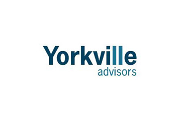
Yorkville is an alternative asset firm based across the river from Manhattan in Jersey City. Their offices used to be in the twin towers and that is why, when we designed their logo, the two "L"s work together to memorialize the fallen structure.
Madison India Capital
New Delhi, India
Madison India Capital called us from the other side of the world to create their logo. We created a smart, strong, easy-to-read block with drop out white type.
Diamond Castle Holdings
New York
Diamond Castle Holdings is a New York-based private equity firm with an interesting name. They wanted a strong type solution that works as a drop out type.
Bregal Partners
New York
Bregal Partners is a private equity fund in New York city that needed a smart type solution to go with a legacy Bregal logo. We used a thick-thin technique with that great looking Franklin Gothic "g".
Cavallino
Sausalito, California
Cavallino is a San Francisco-based investment banking firm. "Cavallino" is Italian for "pony" so we used elegant type with a wonderful line art drawing.
Palladium Equity Partners
New York
Palladium is a leader in the fast-growing U.S.-Hispanic market. The logo was dated and we used a modern font with classic attributes to reflect the vibrancy of their fast-growing market.
Gold Mountain Capital
Dallas
Gold Mountain Capital is a private equity start-up. Our symbol has three mountains creating both an "M" and a gold mountain as a figure-ground reversal.
Rosser Capital Partners
Greenwich, Connecticut
Rosser in a Greenwich-based firm specializing in the consumer industry. We used a classic type that is strong and easy to read punctuated with a monogram-style symbol.
